Why Your Prints Don't Match Your Monitor Created: Jun 10, 2024
The number one complaint that we receive is from new customers who are disappointed that their prints are not matching their monitor. We try to be proactive about this, especially with professional customers who are reselling their prints and make a living from it. We want all of our customers to be happy and satisfied with their purchase. We do everything we possibly can to make sure every print is produced the way it’s supposed to. We always encourage our customers to order a proof first before committing to a larger order so that they can see exactly how their image prints with our lab. Here are the most common reasons why prints don’t match customers’ monitors:
Wrong Color Profile
Sometimes we receive images with the wrong profile space. Like most labs, our setup supports the sRGB and Adobe 1998 color spaces. We don’t support color spaces such as Pro Photo, nor does just about every printer ever made. The Pro Photo space is one the largest color spaces available; it exceeds the color space of any monitor or printer. If you’re using Pro Photo, your prints will very likely appear faded in comparison to how you proofed them on your monitor. We sometimes also see the greyscale profile for black and white images which will cause your black and white images to print muddy and with a green hue. You always want to be within the sRGB and Adobe 1998 color spaces, especially for black and whites. Our website wizard will alert you if it detects a color space on your file that is anything other than Adobe 1998 or sRGB.
Colors are Out of Gamut
Sometimes some or all colors in a photo file can be out of range for that printing process. Most printers can reproduce most of the sRGB color space and even some of the Adobe 1998 color space like we do, however when there are fluorescent/neon type colors, they can be out of range which can produce a print that looks faded and washed out. To best prevent submitting a file for printing that may be out of range, it's important to soft proof. Check out our soft proofing guide to learn how to check that your files colors are within range with our process.
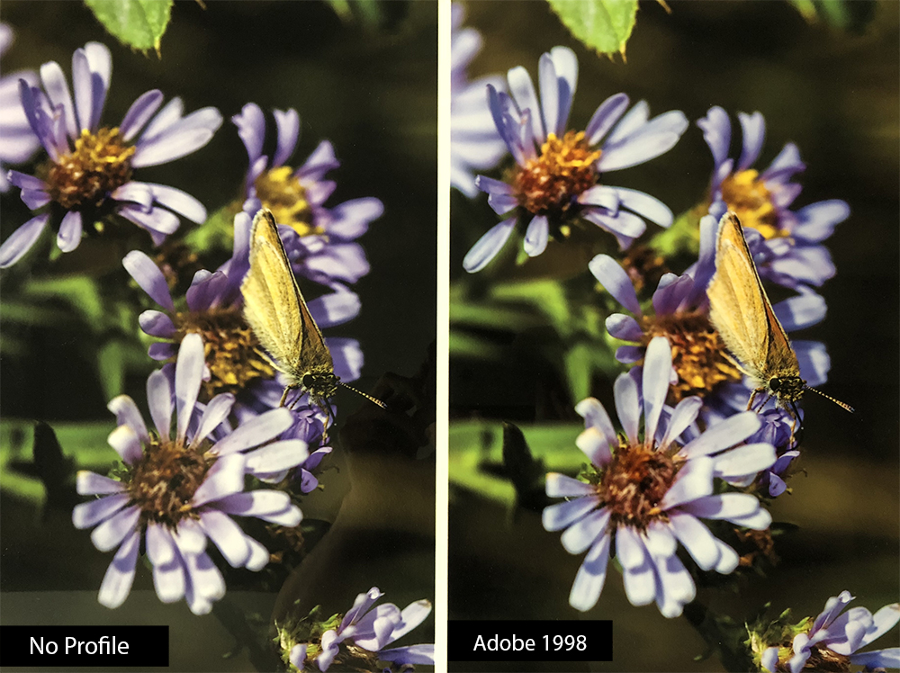
No Color Profile
Probably the number one reason why prints do not match their monitor appearance is that there was no color profile assigned to the image. The ICC color profiles are what communicates to the printer how to translate the colors within the image. Without an assigned color space, the printer software does not know how to translate the colors within the file. This often causes the print to turn out muted or faded and lack any real punch in color but an increased contrast in the blacks.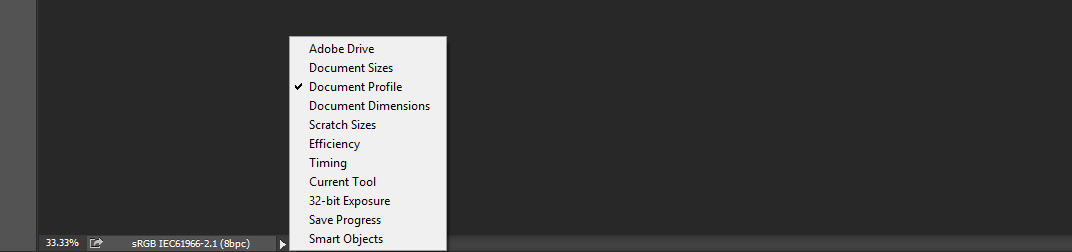
The above image demonstrates how to view the current profile for the image open in photoshop. By clicking on document profile in the bottom left sidebar, Photoshop will display the profile space the current image has assigned to it. If there is no profile, this is where it will show you if you have no profile or the wrong profile. If there is a profile other than sRGB or Adobe 1998, this is when you want to convert your current space to a supported profile such as adobe1998/sRGB. It's important to convert to profile rather than assign a profile.
Wrong Monitor
Most of our customers, even our long-time photographer experts who have been printing and selling their work for many years, will be viewing their images on a standard web viewing monitor. Most computer monitors are designed to make pictures look as vivid and pretty as they possibly can. Manufacturers accomplish this by turning up the contrast and saturation to lead you to believe their monitor is better. This result in highly saturated and contrasted images with bright colors that cannot be produced on most printers. Regular monitors cannot be calibrated to properly proof images. There are monitors specifically designed for proofing photos that can be properly calibrated using a calibrated device such as the Xrite i1Display Pro Device. Purchasing a monitor that can be specifically calibrated for proofing is an expense many photographers prefer to avoid. Having a monitor that is calibrated correctly can save a lot of money over time. You do not need to spend as much on proofs or prints that you are unhappy with. Purchasing proofs is still by far the most accurate way to proof your prints, but a properly calibrated monitor will speed things along for the professional who demands the most of their images. A specialty calibrated monitor can run anywhere from $600 for a Benq SW2700PT and over $3,000 for a top of the line Eizo. The additional cost of the calibration device will run you about $250.
The below image is a photo taken of 2 monitors side by side with some sample images. Both monitors are calibrated using the X-Rite Display Pro device, and both have the same file pulled up on screen. The monitor on the left is a Mac 5k monitor and the monitor on the right is a calibrated Benq SW2700PT. You can see how the monitor on the left is much more saturated which is very noticeable in the sunset sky. This is the best example showing why a display monitor cannot be properly calibrated as most customers would expect their image to be printed like the mac monitor as opposed to the calibrated monitor on the right.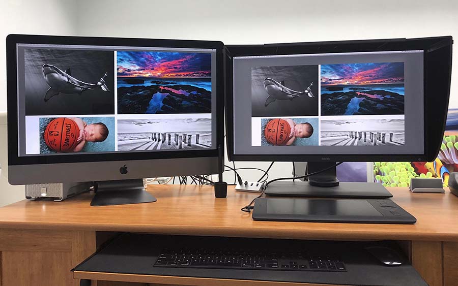
Improperly Calibrated Monitor
On rare occasions, we have had customers point out that their print(s) do not match their monitor. When they specify they are using a calibrated monitor, it should point to something happening during the printing process. However, after asking additional questions, we usually find that the customer did not calibrate the monitor, and therefore is not viewing the images on the screen properly. Even an expensive specialty calibrated monitor requires third-party device to dial in the colors. If you require assistance in setting up and calibrating your calibration monitor, please call the manufacturer to assist you.
Monochromatic Images
A monochromatic image has very few colors or a single color throughout the image. Sepia tone images are the best example. These images are some of the hardest to accurately print in any process. Even a calibrated monitor has a slight bias toward different colors. All prints have the same problem, even when they’re calibrated properly. With a regular color image, you won't notice this slight bias in color. With a monochromatic image, the slightest color shift makes a very noticeable difference. If you’re concerned about getting your color accurate on a print like this, then you need to get a proof.
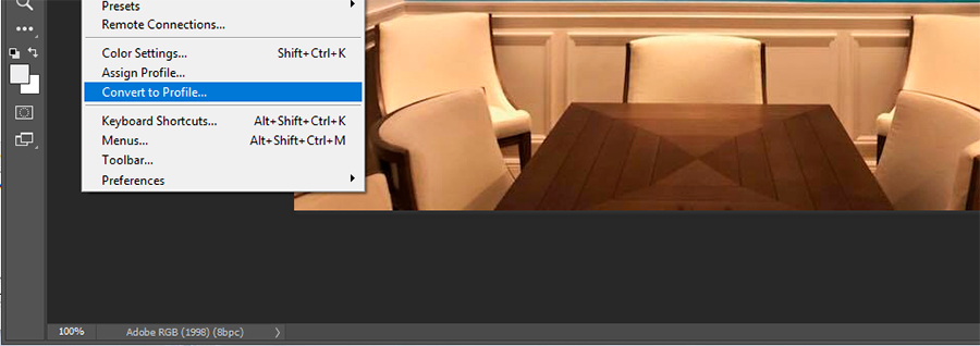
Convert to Profile vs. Assign Profile
Now that you know you need your files to be either in the sRGB or Adobe1998 color spaces, it’s important to understand the correct way to switch them over to the correct space. If the image looks correct on your monitor, you want to use the "Convert to Profile" option as opposed to the "Assign Profile" option. The Convert to Profile option will translate all the colors in your image from the existing color space and make it match as closely as possible within the newly selected space. Some colors that are out of gamut may become slightly faded since the new color space may not support that new color and is coming up with the closest match it has. The Assign Profile option will simply trip away from the current color space and tag the file with the new color space. You will notice the colors will shift when using this option. The Convert to Profile and Assign Profile options can be found in Photoshop under the edit menu at the top.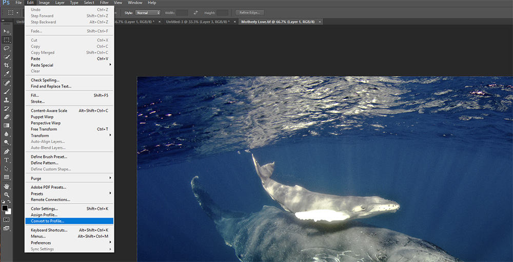
See Related: How much resolution do you need for metal prints?